Interactive Map Examples for Smarter Site Planning
Discover interactive map examples that make planning clearer and more efficient. Learn how teams use real-time maps to decide faster. Read more now.
Interactive map examples are everywhere now, but when you work in planning, infrastructure, or development, they're more than just cool visuals. The right interactive map can bring complex datasets to life, reveal patterns instantly, and help teams make smarter decisions. Instead of scrolling through static PDFs or spreadsheets, today's planners use dynamic maps to visualize data, spot risks, and collaborate in real time.
Key Takeaways
- Interactive maps let users zoom, click, hover, toggle layers, and reveal data points in real time, unlike static maps that only show fixed information
- Key interactive features include zoom and scroll controls, clickable layers and popups, real-time updates, color-coded overlays, and data visualization dashboards
- Anthropogenic Night Light (ALAN) maps reveal development intensity and economic activity patterns from satellite nighttime brightness data, useful for infrastructure demand analysis
- Fiber optic coverage maps help site planning teams determine broadband connectivity at potential development locations and identify service gaps
- Zoning maps with interactive layers turn complex zoning data into something more intuitive by overlaying zones, boundaries, and parcel restrictions in one view
- Isochrone (travel-time) maps show accessibility within specific time or distance thresholds, supporting site feasibility and community impact evaluation
- Sea level rise and wildfire defense maps support long-term resilience planning by visualizing risk scenarios interactively
- Smart Site Plan by Juno Maps consolidates interactive maps, centralized data, and real-time collaboration into one platform for smarter planning decisions
What Makes an Interactive Map Different From a Static Map?
A static map shows information. An interactive map lets you explore it. Users can zoom, click, hover, toggle layers, and reveal data points in real time. Instead of one fixed image, interactive maps use APIs, GIS software, and dashboards to create immersive experiences that help users understand complex datasets.
Key interactive features often include:
- Zoom and scroll controls
- Clickable layers and popups
- Real-time updates
- Color-coded overlays
- Data visualization dashboards
These features help teams visualize patterns, test scenarios, and see how different data layers interact. For planners and agencies, interactive maps support everything from zoning reviews to environmental assessment and infrastructure planning.
Interactive Map Examples in Real-World Planning
It's one thing to talk about interactive maps in theory. It's another to see how they actually help teams plan, build, and make decisions every day. These interactive map examples show what happens when data stops living in spreadsheets and static PDFs and starts living in a map you can explore.
In the sections below, we'll look at several real-world map examples used in modern site planning. Each one highlights a different type of data, from infrastructure and zoning to risk and accessibility. Together, they show how interactive maps bring clarity to complex projects and help teams spot opportunities and challenges earlier.
Think of this as a small showcase of what's possible when maps become interactive tools instead of static images. Each example offers a practical look at how teams are using maps to visualize data, collaborate more easily, and make smarter decisions.
Anthropogenic Night Light (ALAN)
An Anthropogenic Night Light map shows light patterns across a region, revealing development intensity and activity levels. This type of interactive map visualizes nighttime brightness data collected from satellites and sensors.
Researchers often use night light data to study urban growth and infrastructure demand. NASA notes that nighttime light maps can reveal population patterns and economic activity.
In planning, ALAN maps help teams:
- Understand development patterns
- Identify infrastructure needs
- Visualize growth trends
- Support environmental analysis
This map shows how data visualization can turn large datasets into clear insights. Instead of reviewing spreadsheets, planners can see patterns instantly through a heatmap overlay.
Fiber Optic Provider Coverage
Fiber coverage maps are a practical example of interactive mapping used in infrastructure planning. These maps show which areas have broadband access and which don't.
In the U.S., broadband mapping has become a priority for local governments and agencies. The Federal Communications Commission maintains broadband data to help expand connectivity.
An interactive fiber map allows users to:
- Zoom into coverage areas
- Click for provider details
- Identify service gaps
- Support planning decisions
For site planning teams, this map helps determine whether a location has the connectivity needed for development. It also supports coordination between utilities, planners, and developers.
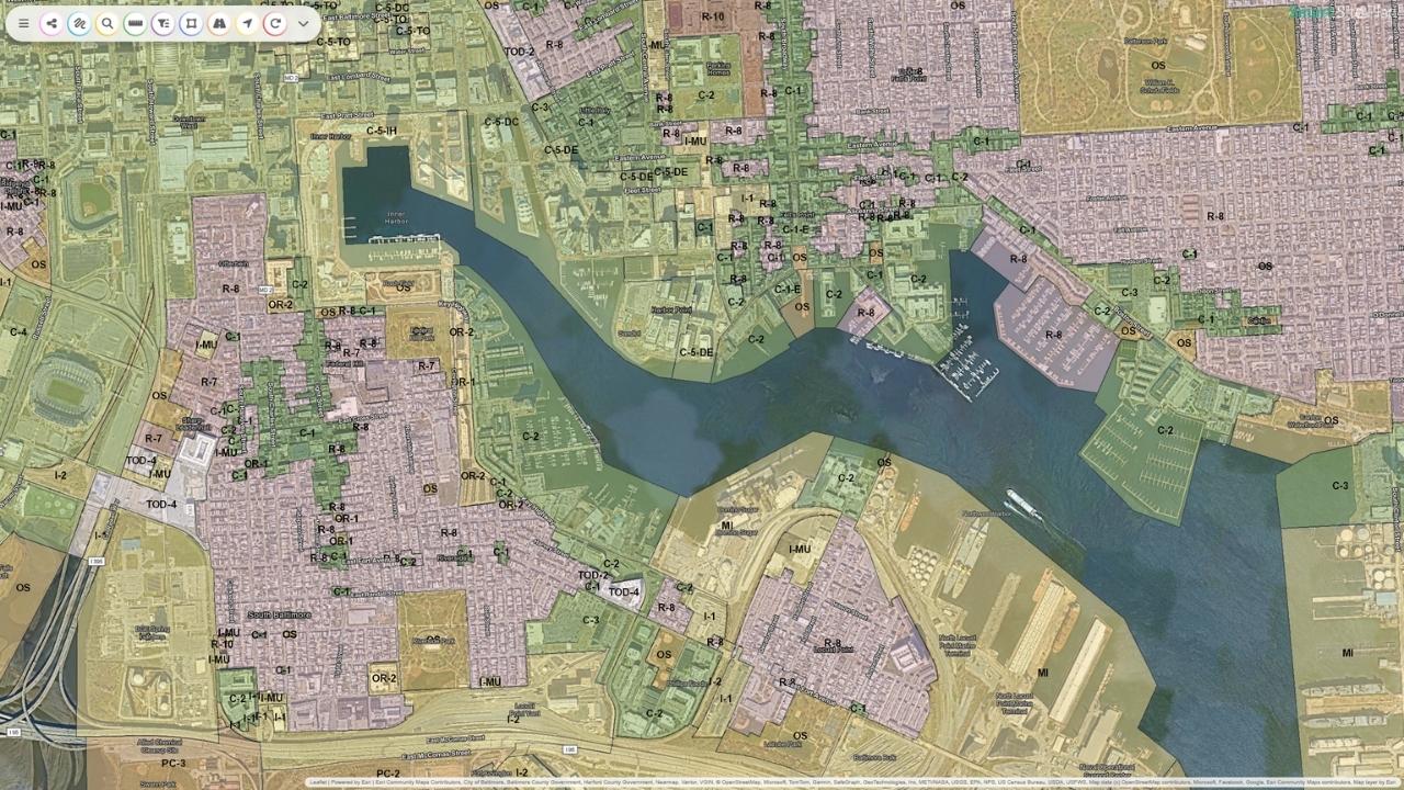
The "Zoning Tetris" Map
The "Zoning Tetris" map overlays zoning layers across parcels to show how regulations interact. Instead of reviewing multiple documents, users can toggle layers and see zoning zones, boundaries, and restrictions in one view. This type of map helps teams understand buildable space and planning constraints.
Interactive zoning maps often include:
- Color-coded zones
- Clickable parcel data
- Popup details
- Overlay comparisons
Local government agencies frequently publish zoning maps online to improve transparency and planning. According to the American Planning Association, digital zoning tools help streamline review and improve communication across departments.
This map example shows how interactive layers turn complex zoning data into something more intuitive and accessible.
Isochrones (Travel-Time Maps)
Isochrone maps show how far someone can travel within a certain time. These maps are widely used in planning, transportation, and development. For example, a developer might want to know which parks or services are within a five-mile radius or a 10-minute drive.
Interactive GIS mapping platforms allow teams to create custom isochrone maps that visualize accessibility and travel time.
Benefits of isochrone maps include:
- Understanding accessibility
- Identifying nearby amenities
- Supporting site feasibility
- Evaluating community impact
These maps help planners see how a site connects to the surrounding area, making them valuable for both public and private projects.
Sea Level Rise Vulnerability
Sea level rise maps visualize coastal risk and flooding scenarios. According to NOAA, sea level rise mapping helps communities prepare for long-term environmental change and infrastructure impacts.
Interactive sea level maps allow users to:
- Toggle future scenarios
- Visualize flood zones
- Assess risk
- Support resilience planning
For coastal communities and agencies, this map serves as a planning tool for long-term investment and environmental protection. Interactive overlays make it easier to understand how water levels could affect infrastructure, housing, and natural resources.
"Fire & Water" Wildfire Defense Map
Wildfire defense maps combine fire risk data with water resources and hydrant locations. This interactive approach helps emergency planners and local agencies prepare for wildfire response.
The National Interagency Fire Center highlights the importance of mapping resources and risk zones to support response planning.
Key features of this type of map:
- Heatmaps showing risk
- Hydrant and water source layers
- Clickable hotspots
- Real-time updates
This type of interactive map helps teams understand risk quickly and coordinate resources more effectively.
Smart Site Plan: Bringing Interactive Maps Into Everyday Planning
As interactive mapping becomes more essential for modern projects, having the right platform to manage it all makes a real difference. That's where Smart Site Plan comes in. This platform helps teams move from scattered files and static documents to one shared space where maps, data, and site plans live together.
Instead of switching between tools, Smart Site Plan brings everything into a single interactive map environment. Teams can explore sites, toggle layers, and visualize multiple datasets in real time. This makes it easier to understand what's happening on the ground and make informed decisions without delays.
Smart Site Plan supports both field and office teams by making data accessible from any device. Whether someone is reviewing zoning, checking infrastructure coverage, or assessing environmental constraints, they can access updates instantly and stay aligned with the rest of the team.
With Smart Site Plan, teams can:
- View multiple map layers in one place
- Create custom map views for specific projects
- Access real-time updates from the field
- Improve communication across departments
- Reduce reliance on static files and PDFs
- Visualize complex data in a clear, interactive format
- Support faster planning and review processes
At its core, Smart Site Plan helps turn geospatial data into practical insight. By combining interactive maps, centralized information, and real-time collaboration, it supports smarter planning and more confident decision-making across every stage of a project.
Learn more about Smart Site Plan!
FAQ
What businesses or industries can benefit from interactive maps?
Planning teams, local agencies, utilities, developers, and infrastructure providers all benefit. Any industry that uses location-based data can make better decisions with interactive maps.
Are interactive maps accessible?
Many modern platforms support accessibility features such as keyboard navigation and screen-reader labels, but actual accessibility depends on how each map is configured.
How do I create an interactive map?
You can create one using GIS software or a mapping platform like Smart Site Plan. Many platforms also offer templates to build maps without coding.
Ready to put this into practice?
See how Juno Maps applies to your specific industry and use case.